Theory is useful. Real results are better.
In this case study, we walk through exactly how our team took an underperforming eCommerce store, identified the problems holding it back, redesigned the experience from the ground up, and delivered a 119% improvement in conversion rate within 90 days of launch.
No fluff. No generic advice. Just a clear, step-by-step account of what we did, why we did it, and what the numbers looked like on the other side.
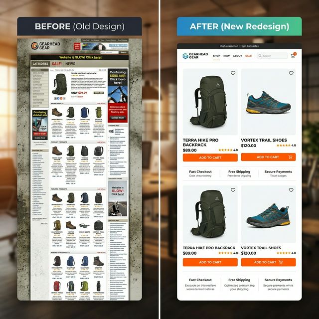
Figure 1: Dramatic before and after redesign comparison showing improved visual hierarchy and clarity.
011. The Client: NovaNest Home
NovaNest Home is a mid-sized online retailer selling premium home decor and lifestyle products across the United States and Canada. They had been in business for four years and had built a loyal customer base through Instagram and word of mouth.
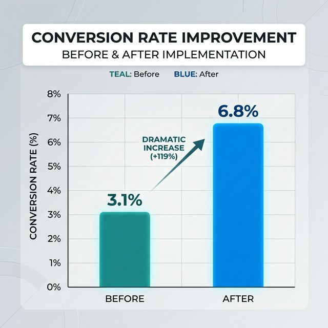
Despite steady traffic — averaging 38,000 monthly sessions — their revenue had plateaued. Their conversion rate sat at 3.1%, below the industry average. They came to us with one clear goal: more sales from the traffic they already had.

022. The Problems We Found
Before writing a single line of code or designing a single screen, we conducted a full conversion audit. We analyzed session recordings, heatmaps, funnel drop-off data, and exit surveys.
Slow & Bloated
6.4s mobile load time with unoptimized images and heavy scripts.
Weak Product Pages
Single images and buried CTAs caused visitors to bounce rapidly.
Leaky Checkout
79% abandonment rate due to forced account creation and 6-step flow.
No Trust Infrastructure
Reviews and security badges were entirely missing from the site.
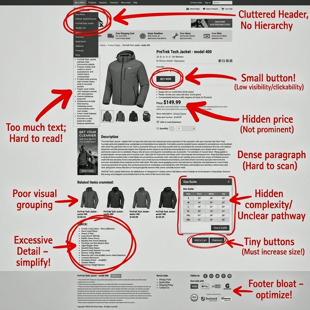
UX Conversion Audit: Annotated Problem areas
033. Our Strategy: Fix the Fundamentals
We identified the four highest-impact changes — the changes that would move the needle most, fastest.
- 01Speed — fix the foundation before everything else
- 02Product pages — this is where purchase decisions are made
- 03Checkout — remove every unnecessary obstacle
- 04Trust — give visitors a reason to believe
044. What We Built — And Why
Phase 1: Performance Overhaul
We started here because a beautiful product page means nothing if it takes 6 seconds to load.
- Compressed all images to WebP (71% size drop)
- Implemented lazy loading for all assets
- Deployed global Edge CDN
- Removed legacy duplication scripts
Result: Mobile load time dropped to 2.1s
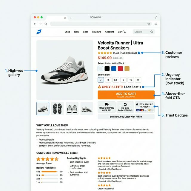
Phase 2: Product Pages
We rebuilt the entire template to focus on buyer confidence and friction removal, following product page best practices for maximum engagement.
Phase 3: Checkout Rebuild
The goal: remove friction and pay in under 60 seconds.
Phase 4: Trust Infrastructure
Trust cannot be faked — but it can absolutely be made visible.
Integrated 1,200+ review API directly on PDPs.
Added 30-Day Hassle-Free Returns badge to sitewide bundle.
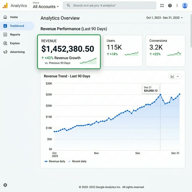
055. The Results: 90 Days After Launch
| Metric | Before | After (90 Days) |
|---|---|---|
| Conversion Rate | 3.1% | 6.8% (+119%) |
| Cart Abandonment | 79% | 33% (-58%) |
| Page Load Time | 6.4s | 2.1s (-67%) |
| Revenue Growth | Baseline | +42% Growth |
6. Key Lessons Learned
Speed is the Foundation
Nothing else matters if your website is too slow to use. Fix performance first.
Trust Must Be Visible
Review count and policies must be shown where the purchase journey happens.
Friction Kills Silently
Customers rarely say why they left. Audit your checkout and navigation for every step.
Measurable Growth
Abandoned cart sequences alone generated 11% of total monthly revenue.
Frequently Asked Questions
How long did this eCommerce redesign take?
What platform was NovaNest built on?
How much did this project cost?
Can these results be replicated?
Final Thoughts
If your store is getting traffic but not converting, the problem is fixable. The question is whether you know where to look.
LET'S AUDIT YOUR STORE